Understanding Demographics & Neighborhood: How to Read Relocheck Data Around a Property Correctly
Demographic data and neighborhood profiles play a major role in whether a residential location fits daily life, family needs, rental demand, and long-term value development. This article shows how to interpret Relocheck visualizations, including the 1 km2 profile, micro-location comparison, residential milieu, and household structure, correctly, objectively, and comparably.
12.03.2026
Many location decisions fail not because of the property itself, but because of a wrong assumption about the surroundings: does the residential environment fit our daily life? How stable is demand if we want to sell or rent it out later? How good is the social infrastructure in real life, not just on paper? This is exactly where demographics help: they translate neighborhood context into measurable characteristics such as age structure, household types, employment rate, origin structure, and in-migration or out-migration. For families, this matters because it can indirectly show whether children typically live in the area, and therefore often also the density of suitable amenities, whether households tend to be larger or smaller, and how a neighborhood changes over time. For renters, demographics are an early indicator of residential milieu and daily rhythm: an area with many one-person households often functions differently from one with many three-to-five-person households. For buyers and investors, stability, demand profile, and risk factors are central: certain demographic patterns often correlate with lettability, turnover, and long-term value stability. Important: demographics do not judge people. They provide comparative data that helps place locations objectively side by side. That is exactly what a standardized location report like Relocheck is designed for: the same structure and the same visualizations, so that differences between two properties are not just felt, but understandable.
- ✓ Derive concrete everyday-life hypotheses from the data, for example household sizes and age structure
- ✓ Always compare locations within the same radius
The 1 km2 Tile “Demographic Data”: What Exactly Is Summarized There?
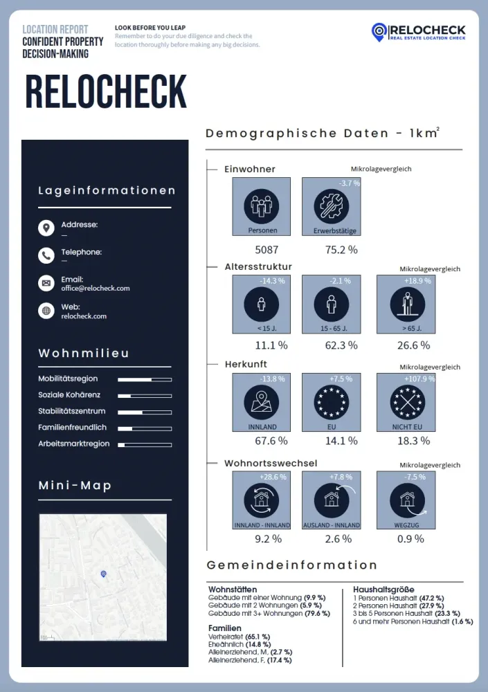
The central demographics page in the Relocheck report is set up as a compact dashboard. It shows several tiles with symbols for residents, employment, age groups, origin, and residential mobility, supplemented by a micro-location comparison in percentage values, a mini map on the left, and below that municipal information with tables on dwellings, family types, and household sizes. The key point is standardization: you do not get a single metric, but a profile. At its core, this profile answers four questions: how large and active is the surrounding area, meaning the number of residents in the defined radius and the share of employed people? What is the age structure? How is the origin structure composed, domestic, EU, non-EU? How dynamic is the area, meaning moves within the country, arrivals from abroad, and departures? Together with household and building types, these four blocks form a reliable basis for comparing the neighborhood as a location factor. You do not need to know perfect values for this. You only need to understand how to read the visualization and what different patterns can mean in practice. The major added value is that you can systematically distinguish between two properties that both seem nice. For example, both may have similar rents, but one location has significantly more one-person households and high turnover, while the other has more family households and a more stable structure. These are differences that are hard to detect reliably during a viewing, but become visible very early in the data.


Residents & Employment: How to Interpret the Tiles Meaningfully Without Drawing the Wrong Conclusions
In the report, the number of residents is shown as an absolute number of people, while employment is shown as a percentage share. This combination matters because it measures two different things. The resident count in the 1 km2 section says something about density and potential demand in the immediate surroundings. High density can bring advantages, such as more services, better public transport frequency, and more amenities, but it can also come with stronger usage pressure, more turnover, and more activity in public space. Low density can feel quieter, but often means longer distances to services. The share of employed people is an activity indicator: it helps you understand roughly whether the area is shaped more by working households or whether relatively more people are retired, in education, or otherwise not employed. How do you use this in practice? For renters: a high employment share can mean that typical daily rhythms are more commuter-driven, with early mornings and later afternoons, which can affect parking pressure or traffic in the area. At the same time, very high density combined with high employment can indicate an urban environment with strong demand. For buyers: these values are not a guarantee, but they are a good screening tool. If you want to sell later, an environment with a clear demand base, population plus activity structure, is often more robust than one that depends heavily on special factors. For investors and agents: together with household sizes, shown below, the resident count and employment share often allow you to infer roughly which apartment sizes and features are typically in demand in the area, and how well a property fits that demand profile. Important: the tile is just one segment. What matters is comparing several locations within the same framework. An isolated value without a reference is rarely meaningful. As a standardized comparison value across several properties, it becomes very powerful. Note on the micro-location comparison percentage shown above or near the tile: this percentage is a relative comparison value, meaning the micro-location is being compared with a reference. Use it as a directional signal: is the location above or below the reference level? For decisions, that is often more important than the absolute number.
Age Structure: What the Three Age Tiles Mean in Practice
The report visualizes age structure in three groups: under 15 years, 15 to 65 years, and over 65 years. This is deliberately broad, but very useful for location decisions because it translates the neighborhood into life phases. Here is how to read the visualization: for each age group, you see a percentage value showing its share in the 1 km2 section. Above it, you see a micro-location comparison in percentage terms that shows the deviation from the reference. Together, these two values answer two questions: what is the distribution, and is it typical or atypical for this city or municipality? What does a high share under 15 mean? For families, it can be an indicator that children are common in the area. That can, but does not have to, go along with child-related infrastructure and a corresponding residential milieu. For buyers, it is a sign that larger apartments or houses may be in higher demand. For investors, it can indicate demand for family-friendly layouts and longer tenancy periods. What does a high share over 65 mean? This is often a stability indicator because older households tend to move less frequently on average. At the same time, it can suggest that the area is quieter, but possibly less dynamic. For buyers, that may be attractive depending on strategy, because of calm and continuity, or it may be a reason to look more closely at future development, for example whether rejuvenation is taking place. For investors, it can mean that accessible features or elevators may be valued more in the area. The 15 to 65 group is usually the working and education phase. A high share is normal in many urban locations. It becomes especially interesting when the micro-location comparison deviates strongly. That means the location is clearly younger or older than the reference area within the same city or municipality. Practical tip: always use age structure together with household sizes. An area can be young and still consist mainly of one-person households, for example students or young professionals. Or it can be young and have many three-to-five-person households, which is more family-oriented. Only the combination creates the full picture.
Origin (Domestic/EU/Non-EU): How to Use the Shares Objectively and What You Must Not Infer from Them
The report shows the origin structure as shares for domestic, EU, and non-EU, again as tiles with percentage values plus micro-location comparison. The key here is using it with the right purpose: this distribution is not an evaluation, but a structural characteristic. It can help assess certain location questions objectively, for example language and educational offerings in the area. In some places, multilingualism is more present in everyday life, which may be relevant for families, for example bilingual education paths, or for rental decisions. Turnover patterns: together with residential mobility, a higher level of international mobility, EU or non-EU, can indicate more dynamic neighborhoods, but does not have to. Breadth of demand for rentals: for investors, a more diverse demand profile can mean that lettability depends less on a single target group. What you must not infer from it: no conclusions about living quality or safety based on origin shares. Such conclusions would not be data-based, but prejudice. The value only arises in combination with objective location criteria such as household structure, stability or turnover, and infrastructure. Practical tip: if you use origin data, use it only as a comparison variable between two locations to get a sense of internationality, mobility, and potential breadth of demand, not as a standalone criterion. The micro-location comparison is especially helpful here: a location may look similar in absolute numbers, but differ strongly relative to the city level. That deviation from the norm is often the actual information you need for a location profile.
- ✓ Use origin shares only as a structural characteristic and comparison factor
- ✓ Draw no normative conclusions, only combine them with objective location data
Residential Mobility: The Underestimated Stability and Price Indicator
The residential mobility block typically shows three tiles: moves within the country, arrivals from abroad, and departures. Again, the micro-location comparison is included. Why is this so important? Stability: high departure or relocation rates often indicate higher turnover. That can be completely normal, for example in student areas or very central rental markets, but for families or buyers looking for continuity it can be a decisive difference. Lettability: for investors, high turnover can mean more frequent reletting, more effort, but possibly faster adjustment to current market levels. Low turnover can mean fewer vacancies and lower switching costs, but also less rotation for adjusting rents to new market levels. Neighborhood dynamics: turnover changes the residential milieu. In very dynamic districts, the neighborhood can change more frequently, which some people experience as lively and others as unsettled. Here is how to read the visualization correctly: the percentage value on each tile shows the share or extent within the area being viewed. The micro-location comparison shows whether turnover in the immediate surroundings is higher or lower than in the reference area. For decisions, that is often more important than the absolute number, because high turnover in a university town means something different from high turnover in a small municipality. Practical tip for buyers: if you may sell again in the future, stable locations with lower turnover often have more predictable demand. Practical tip for renters: if you are looking for calm, lower turnover, together with other factors, can be an indicator that the surroundings are less in motion. Important: residential mobility is not a replacement for other data, but one building block. A location can be stable and still not fit you, but when comparing two locations it is often a very clear distinguishing feature.
- ✓ Always assess turnover relative to the city or municipality level using the micro-location comparison
- ✓ Treat stability versus dynamism as a conscious decision

Micro-Location Comparison: Why the Small Percentages Are Often the Most Important Information
On the tiles, there is a percentage value above the symbols labeled micro-location comparison. In practice, these values are often the biggest lever because they tell you whether the immediate surroundings deviate from the normal pattern of the reference area. Use it methodically like this: for each block, residents and employment, age structure, origin, and residential mobility, look for noticeable deviations. Translate the deviation into a hypothesis. Example: significantly higher share of people over 65 than the reference suggests the hypothesis of a quieter, more stable environment. Check that hypothesis against the tables, household sizes and building types, and against your intended use. A quiet environment may be excellent for families, or unsuitable for a short-term rental model. Then compare it with a second property. The micro-location comparison is especially strong when used in paired comparison: you immediately see where one location is different. Important: micro-location comparison does not automatically mean better or worse. It means different. That difference is exactly the relevant information when you are looking for a property that fits your life reality or your investment strategy. If you use micro-location comparison values consistently as a deviation analysis, you get a kind of location diagnosis: where is the location older or younger, more stable or more dynamic, more international or more domestically oriented, denser or less dense than the reference area? That is extremely helpful because viewings often do not make these dimensions visible reliably.
- ✓ Micro-location comparison means deviation, not evaluation
- ✓ Deviation -> hypothesis -> plausibility check with the tables
- ✓ Always use it in paired comparison, Property A versus Property B
Residential Milieu: What the Bars “Mobility Region, Social Cohesion, Stability Center ...” Actually Say
On the left side of the demographics page, the report shows a module called residential milieu with several horizontal bars. Typical dimensions include mobility region, social cohesion, stability center, family-friendly, and labor-market region. This display is deliberately designed as a profile: you do not get a single score, but several axes that together form a pattern. Here is how to read the bars correctly: each bar is a relative expression within a scale frame, shown visually as a filled share. Even if the exact scale is not written out as a number, you can compare two locations very well because the same visualization is repeated each time. This value becomes especially useful when you combine it with the hard demographic tiles. Example: if family-friendly appears high, but household sizes are almost entirely one- and two-person, that is a signal to look more closely, for example whether the neighborhood is changing or whether family-friendly is meant more in an infrastructural sense. How can these axes be interpreted without overinterpreting them? Mobility region: an indicator of how strongly the location is integrated into a functional mobility system, for example commuter and movement patterns of the region. For renters and buyers, this is less about travel time, that would be a commuting issue, and more about regional integration. Social cohesion and stability center: indicators that can point to continuity, attachment, and stability in the neighborhood. For families, stability can be attractive because of consistency in the surroundings and contacts. For investors, it can indicate lower turnover. Family-friendly: as a milieu axis, this should be understood as an environment profile, not as a guarantee of any specific facility. It is a signal that should then be checked against real criteria such as apartment size, budget, and the kind of surroundings you want. Labor-market region: more of a macro profile, showing how strongly the location sits within a labor-market region. For investors, it can indirectly signal demand strength. For buyers, it can serve as background information. Practical tip: use residential milieu bars to cluster similar locations. If you look at five properties, you will often recognize two or three milieu types. That reduces complexity: you are no longer comparing five individual properties, but two or three location profiles. Important: residential milieu is an orientation tool. The hard, directly measurable tables, households, dwellings, and age structure, remain the basis. The bar block helps you read the profile, not replace it.
- ✓ Understand residential milieu as a profile with several axes, not as a single value
- ✓ Always check the bars against the hard demographic tables
- ✓ Cluster several properties into milieu types to compare them more effectively
What Matters to Whom? A Short Logic for Families, Renters, Buyers, Investors, and Agents
To prioritize the many demographic signals quickly, it helps to use a target-group logic. It is not exclusive, you may have several goals, but it prevents you from getting lost in the numbers. Families: prioritize household sizes, three to five persons, age structure under 15, and stability, residential mobility and departures. Goal: find an environment that fits family life and does not keep changing. Renters: prioritize household sizes, does the area fit your daily rhythm, building types, multi-unit versus smaller-scale housing, and micro-location comparison, does the location deviate strongly from the city norm? Goal: get a realistic picture of everyday life before signing. Buyers: prioritize stability and turnover, household sizes, and the overall profile from age plus employment. Goal: make current use and future value more understandable. Investors: prioritize household sizes as a target-tenant profile, turnover as rental-market dynamics, employment as a proxy for demand strength, and building structure as the typical stock. Goal: define lettability and risk. Agents: prioritize micro-location comparison plus household sizes plus building types, because that creates an objective positioning: which target group fits the location in market logic? Goal: advise with location data instead of gut feeling. The idea behind Relocheck is that all these customer groups can work with the same visualizations, just with different weighting. That is exactly what reduces misunderstandings: the discussion is no longer whether an area feels good, but which location characteristics fit the decision at hand.
- ✓ Prioritize two to three metrics per target group instead of treating everything as equally important
- ✓ Use objective location characteristics as the shared basis for discussion
Limits of the Data: Why You Should Use Demographics as Decision Support, Not as an Oracle
Even a data-based location report remains a model of reality. Demographics are derived from data sources, aggregated into categories, and tied to a defined area. That is ideal for comparability, but it comes with limits. What should you keep in mind? Time reference: demographic metrics are rarely live. They describe a statistical state or a period of time. Aggregation: a 1 km2 section smooths out differences within the neighborhood. If you are searching very close to the edge of a district, for example directly next to a very different zone, a micro-level site visit can help. Causality: demographics alone do not explain why prices rise or fall. They are a profile characteristic. For price logic, you also need market factors and property factors. Quality assurance and model limits: the report notes that despite high standards, accuracy, completeness, and model reliability cannot be guaranteed in every case. That is exactly why clean use as a comparison and screening instrument is so important. If you accept these limits, the benefit becomes maximal: demographics give you objective, standardized anchors for comparison. They do not replace the viewing, but they ensure that you view more selectively and recognize location differences faster.
- ✓ Use demographics as a profile and screening tool, not as absolute truth
- ✓ Always base the decision on location plus property plus market


