Commute Times and Accessibility: Reading Isochrones Correctly for Property Decisions
Commute times determine how practical a residential location really is, for families, renters, buyers, and investors alike. The Relocheck location report makes accessibility measurable and comparable with isochrone maps and destination tables: by car, by bike, and on foot, with clear color logic and easy-to-interpret time windows.
12.03.2026
During the property search, a 'good location' is often equated with a district name, a perceived neighborhood quality, or a rough distance to the city center. But for everyday usability, something else matters: the realistic time needed to reach important destinations. Commute times and accessibility are therefore an especially strong location indicator because they affect daily life. Anyone who regularly loses an extra 20 to 40 minutes per trip loses noticeable time, energy, and flexibility over weeks and months. That is exactly why the Relocheck location report emphasizes that shorter travel times to destinations such as work, schools, shopping, and public transport can increase a property's location value, not as an opinion but as a consequence of measurable usability. For families, this means childcare and school should not just be 'somewhere in the city' but within a time window that works in everyday life, even if a child is sick, an appointment comes up, or the trips happen several times a day. For renters, accessibility is often the biggest lever on quality of life because they typically do not keep an apartment for decades but must integrate it into their daily routine immediately. For buyers, accessibility is a value-stabilizing factor: locations with good connections usually remain in demand over the long term because they suit many life situations. For investors and agents, accessibility is an objective benchmark that can be used in advisory work, rental positioning, and exit arguments without drifting into subjective debates. The Relocheck location report makes this factor understandable by not just describing accessibility but visualizing it with isochrone maps and complementary tables that show concrete destinations and travel times. That turns 'the location seems practical' into a testable statement: which destinations can be reached in 5, 10, 15, or 20 minutes, and by which mode of transport?
- ✓ Define key everyday destinations
- ✓ Set a maximum commute time per destination
- ✓ Check driving, cycling, and walking separately
- ✓ Assess travel times realistically during peak hours


Understanding Isochrone Maps: What They Show and Why They Are Better Than Straight-Line Distance
Isochrone maps are the centerpiece of the commute-time analysis in the Relocheck location report. Unlike circles around a location, which show only straight-line distance, isochrones represent real accessibility: they show the areas that can be reached from a starting point within a certain amount of time, typically in minutes. To do this, they take route networks, path types, and other factors into account, not just kilometers. The visualization uses lines and color coding. The report explicitly states that darker colors represent longer travel times: the darker the area, or the farther it is from the fast core area, the longer it takes to get there. That matters because people often visually assume the opposite, for example "strong color = good." Here, color is a time code, not a judgment. It is also important that isochrones are rarely perfectly round. If you see an irregular shape, that points to real barriers or detours. That may be an unfavorable street layout, separation by rail lines, rivers, or missing crossings, or an urban structure that looks close but is actually hard to reach. These are exactly the cases that often lead to wrong decisions in traditional listing research: an apartment seems "central" because the map shows nearby destinations, but in practice the connection is cumbersome. Isochrones reduce that risk because they show time instead of distance and therefore reflect everyday reality better than simplified circle methods. The report also points out that isochrones can take multiple factors into account: road conditions, traffic volume, transport options, and other influences. That does not mean every minute is guaranteed, but it does mean the visualization provides the best possible approximation of realistic travel time and is therefore especially strong as a comparison tool.
- ✓ Clarify the color logic before reading
- ✓ Compare time, not kilometers
- ✓ Compare multiple properties using the same time windows
Interpreting Car Isochrones: What the Map Reveals About Comfort and Risk
The car isochrones in the Relocheck report answer a simple but crucial question: which areas can be reached within specific numbers of minutes when you drive? The report explicitly describes these maps as showing areas of equal travel time and notes that they can incorporate factors such as traffic volume and road conditions. For buyers and renters, the interpretation becomes especially valuable when you do not misunderstand the map as "range" but as a time budget. On paper, a property may seem well located if you can supposedly "get anywhere by car in 10 minutes," but the isochrone shows whether that promise holds across the map or only along a few main corridors. If the isochrone is heavily constrained in certain directions, that points to structural detours, bottlenecks, or a connection that works well in one direction but poorly in another. Those asymmetries matter for families, for example because school routes are not always in the "good" direction, and for investors because asymmetric access can narrow the target group. Another important point of interpretation is that car isochrones help identify how dependent a location is on the car. If central everyday destinations only appear within larger time windows, that may mean the location is hardly practical without driving. That is not automatically bad, but it changes the usage profile. For renters without a car, it is a risk. For buyers, it can mean a narrower target group in a later resale or rental scenario. The report complements the maps with tables showing how long it takes to reach important places such as pharmacies or grocery stores. That combination prevents a common mistake: the map shows a lot of coverage, but you still do not know whether the specific destinations you care about are included. Only the map plus the destination table creates a reliable statement: not just "where can I get," but "can I get to what I need?"
- ✓ Check the car isochrone in every direction
- ✓ Define time windows for work and school
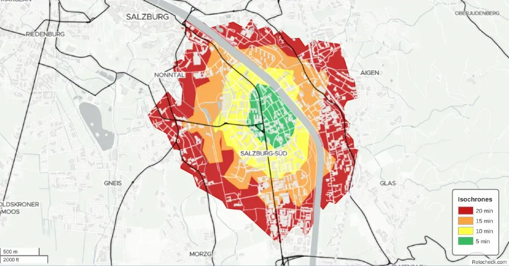
Walking and Cycling Isochrones: Assessing Everyday Life Without a Car Realistically
The Relocheck location report does not show accessibility only for driving, but also for walking and cycling. That is especially important because lifestyles, household types, and mobility realities differ: families need routes that work without complicated logistics, renters often want daily essentials and public transport within walking distance, and investors look for locations that are attractive to many target groups. The walking isochrones in the report are described as "Explore your area on foot" and make visible which areas can be reached within defined walking times. The decisive interpretation point here is that walking times are highly sensitive to barriers. A distance of 800 meters may either be an easy walk or, because of awkward crossings, missing sidewalks, or detours, effectively not walkable at all. Isochrones help reveal such differences because the area shown reflects not just distance but also time and route structure. The cycling isochrones complete the picture by showing which areas can be reached within typical riding times. The report connects this view with practical everyday destinations: daily necessities such as local shopping, public transport, and parks, education and medical facilities, local infrastructure such as a hardware store, as well as longer trips to larger parks or more specialized offers. At the same time, the report makes it clear that time spans above 20 minutes are more acceptable for larger or less frequent destinations, such as an airport or university. That logic is central to interpretation: not every destination has to be reachable in 10 minutes, but the everyday basics ideally should be. In practice, that means a property is more suitable for everyday life when local shopping, childcare, public transport, and basic services can be reached on foot or by bike within short time windows. That reduces dependencies, lowers mobility costs, and increases flexibility in daily life. For investors, it improves rental appeal because a location that does not strictly require a car appeals to a broader target group. One more important point: walking and cycling isochrones are not a nice extra. They are an objective answer to a concrete question: how robust is a location if mobility needs change because of a job change, a growing family, less driving, or old age? Locations that perform well here often lead to a more resilient location decision.
- ✓ Check local shopping within the walking-time window
- ✓ Assess public transport access on foot realistically
- ✓ Define cycling time windows for everyday life
- ✓ Accept 20+ minutes only for specialized destinations
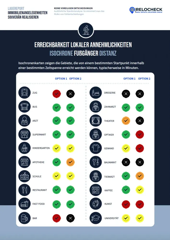
Commute-Time Tables and Color Codes: How to Read the Accessibility of Specific Amenities
A common problem with maps is that they create an impression without supporting a concrete decision. The Relocheck location report solves that by supplementing the isochrone maps with tables. These show how long it takes to reach different types of important places and list the two nearest options for each category. That is crucial for an objective decision because it is not enough to know that there is a supermarket somewhere. What matters is whether you can reach it within a time window that works for you. The table uses the same color scheme as the isochrone maps, making the interpretation consistent so you can compare map and table directly. Especially important is the rule described in the report: gray means that a destination is not reachable within the specified time. This seemingly small detail is extremely valuable in practice because it makes hard limits visible. "Not reachable" within a time window is a clear statement, and one you will almost never find in listings. The categories in the report are broad, for example train or bus, doctor, supermarket, kindergarten, pharmacy, school, restaurants, and others. For interpretation, the rule is this: you should not weight every category equally, but prioritize them based on your life model. Families prioritize childcare, school, and everyday essentials. Renters prioritize local shopping and public transport. Buyers also prioritize robust everyday routes because they are planning for the long term. Investors and agents look at whether a location appeals to a large target group and whether core needs are covered without long trips. One more important interpretation note: the table lists two options per category. That is not just nice to have, but a stability indicator. If option 1 is easy to reach but option 2 is far away, that can mean the offering is selective and alternatives are missing. If both options are within similar time windows, the location is often more resilient. If a store closes, a route is disrupted, or needs change, the local supply situation remains stable. That turns maps and tables into a systematic framework: the map shows the time area, the table shows the concrete destinations and how accessible they are. Together they provide a comparison model that you can apply identically across multiple properties.
- ✓ Interpret gray as a hard limit
- ✓ Use options 1 and 2 as a stability indicator
- ✓ Prioritize categories based on your life model
Avoiding Typical Mistakes: What Commute-Time Visualizations Often Reveal
Many wrong decisions do not happen because people are irrational, but because they lack objective comparison data. Accessibility is then judged through shortcuts: "looks close," "it is centrally located," or "everything is accessible by car." Isochrone maps and destination tables expose exactly these shortcuts. One classic mistake is confusing distance with time. Two kilometers can be faster or slower than five kilometers depending on the route. Isochrones solve that by showing time windows. A second mistake is assuming that accessibility is symmetrical. In reality, infrastructure, traffic corridors, or barriers can mean that you get somewhere quickly in one direction but much more slowly in another. Isochrones show these differences in their shape, and that is exactly where their strength lies. A third mistake concerns household reality: many people only check the route to work. But the report emphasizes accessibility to important destinations such as work, schools, shopping centers, and public transport. That is an invitation to see the location decision holistically. A location may be perfect for the job but weak for childcare, shopping, or medical care. Or the reverse: a location works excellently in everyday life but is too far for one specific commute. Without visualization, these trade-offs remain invisible. The report logic therefore supports a clean decision process: first define destinations, then define time windows, then compare objectively using isochrones and tables. This is not an evaluation in a subjective sense, but a process that creates transparency. That comparison value is the central benefit: not talking one property up or down, but testing multiple locations against identical criteria.
- ✓ Do not evaluate only the commute to work
- ✓ Define time windows for core destinations
- ✓ Check directional asymmetries deliberately
Conclusion: Accessibility Is Not a Feeling, It Is Comparable Location Reality
Commute times are one of the few location factors that are relevant to practically all target groups at the same time. Families gain time and predictability, renters gain everyday usability, buyers gain long-term practicality, investors gain rental appeal and stability, and agents gain an objective basis for advice and comparison. The Relocheck location report makes this dimension transparent by visualizing accessibility with isochrone maps and making it concrete with destination tables. Isochrones show time periods as areas, the color logic encodes time windows, and the tables translate those areas into concrete destinations, including the crucial information when something is not reachable within a given time window. That creates a clear, data-based foundation: not "the location feels good," but "the location works within my defined time windows for my relevant destinations." Anyone who wants to compare properties systematically needs exactly this translation of location into measurable reality.
- ✓ Write down destinations and time windows
- ✓ Read isochrones separately by mode of transport
- ✓ Use destination tables as a decision test
- ✓ Compare multiple locations in exactly the same way


