Sunlight Hours and Shading: How to Interpret Daylight Maps in the Relocheck Location Report
How many sunlight hours does a property really get, and when? This article shows how to read shadow maps, monthly views, and sun-path graphics in the Relocheck location report so you can compare locations objectively and avoid typical mistakes when judging light and shading.
12.03.2026
Why Sunlight Hours and Shading Are Hard Location Factors
Daylight affects everyday life more strongly than many people assume when searching for property. It influences living comfort, including brightness in living rooms, home offices, and children's rooms, the usability of balconies, terraces, and gardens, the subjective feeling of space, and depending on the floor plan even whether rooms need artificial lighting during the day. At the same time, sunlight is not a nice extra, but in many situations a measurable location parameter created by the surroundings: orientation, neighboring buildings, terrain, and seasonally changing sun positions. The decisive point is this: you cannot reliably infer light from a single viewing. Anyone visiting in June at 6 pm experiences completely different light than someone viewing in November at 10 am. That is exactly where a data-based location report becomes valuable. Instead of impressions, it provides visualizations showing how sunlight hours and shadows are distributed spatially in the immediate surroundings and how these patterns change across months. This makes daylight comparable, not just between two apartments in the same neighborhood, but also between districts or across several properties that are currently on the shortlist. For families, that means realistically assessing whether play areas, the living kitchen, or children's rooms are bright in everyday life and whether outdoor areas remain usable. For renters, it means understanding whether home office, plants, winter brightness, or a permanently dark corner will become an issue. For buyers and investors, it means assessing whether light quality, and therefore demand and relettability, is stable and whether shading is a long-term risk, for example due to dense neighboring development or strongly restricted winter sun. One more important point: more sunlight is not automatically better. High solar exposure can lead to overheating in summer, while too little winter light reduces living quality. The real value comes when you compare by the same criteria: which rooms need light at which times, which outdoor space should be usable when, and which shading comes structurally from the surroundings regardless of how attractive the apartment itself looks inside?
Which Daylight Visualizations the Relocheck Location Report Provides
The Relocheck location report does not treat sunlight hours and shading as a vague impression, but as a visual analysis package. It typically combines three complementary building blocks. First, a shadow map as a heatmap labeled shadow map or sunlight hours. It shows spatially where many or few daylight hours reach the surroundings. This lets you see at a glance which building parts, for example courtyard sides, terrace areas, or street-facing facades, tend to receive more light and where shading dominates. Second, monthly views. There are separate maps or monthly modules for each month. That matters because sun angle and sun height vary strongly over the year. A location can feel sunny in summer and still remain permanently shaded in winter. Third, sun paths in horizon view. This graphic shows the sun's angle and height through the day in a way that makes both terrain horizon and neighboring building horizon visible as a silhouette. That allows you to interpret at which times of day direct sunlight is geometrically possible at all and when buildings or terrain block the sun. It is also important to understand what these models deliberately do not show, or only show to a limited degree. Daylight maps are an objective approximation of the location, but they do not replace on-site observation for special questions, and real cloud cover or tree cover can change the light as it is actually experienced. As a decision tool, these visualizations are strongest when you use them to compare several properties: same method, same presentation, clear differences.
How to Read the Shadow Map Correctly: Colors, Patterns, and Typical Pitfalls
The shadow map in the report is meant as a heatmap. It translates daylight hours into colors so you can identify spatial differences quickly. In practical terms, lighter zones stand for more daylight hours and darker zones for fewer. That means you are not reading isolated numbers, but patterns: where are the light corridors, where do shadow fans appear along building edges, and which areas remain relatively dark across larger surfaces? Building footprints are usually clearly separated, often as light or white areas on the map, so you can see which structures create shadows. This is especially valuable in perimeter-block development, inner courtyards, narrow street canyons, or sloped sites. Pay attention to transitions. If a surface changes abruptly from light to dark, this is often a sign of a shadow edge created by a neighboring building or terrain break. These edges are highly relevant in practice because they determine whether a balcony still gets sun at 3 pm or whether the courtyard is already shaded from midday onward. One common interpretation mistake is the assumption that one bright area means the property is sunny. The correct reading is more precise: the map shows where more daylight hours reach the surroundings, not that all rooms automatically benefit equally. What matters is where your windows are and how the floor plan is oriented. Use the map as a location indicator: does the bright zone lie mainly in front of the south- or west-facing facade, or mostly on open space outside the building volume? Another common mistake is relying on a summer viewing. A heatmap without monthly context can distort your impression. That is why the next step should always be to compare it with the monthly maps: is the bright zone stable throughout the year, or is it seasonal? For agents and professionals, the heatmap is also a strong communication tool. It lets you show buyers and renters transparently that light conditions depend not only on the apartment itself but strongly on the immediate surroundings, and that there are understandable data-based reasons why two apartments with similar prices in the same district can feel very different in terms of brightness.
Using Monthly Maps: Why Winter Sun Often Decides Everyday Use and Value
The monthly maps are the part that prevents many wrong decisions because they show how strongly shading changes over the year. The report deliberately works with separate monthly views because in winter the sun stands lower, shadows become longer, and shading from neighboring buildings or terrain becomes stronger. To read these monthly modules usefully, start by identifying the critical months for your use case. For many households, these are November through February because people spend more time indoors and daylight becomes more important both psychologically and functionally. If the map becomes noticeably darker across broad areas in these months, that is a warning signal for a lasting winter-light deficit. It is also important to check whether the light quality in summer is almost too good. High solar exposure can feel pleasant, but depending on building structure, window size, and shading devices, it can also lead to overheating in July and August. Monthly maps help make this peak visible so it can be planned for consciously with external shading, cross ventilation, or the placement of workspaces within the floor plan. Also pay attention to the typical seasonal shifts. Transition months such as March and April or September and October often show whether a location is balanced or whether it strongly tilts toward one time of day, for example only morning light but hardly any afternoon sun. Do not interpret monthly maps in isolation, but as a progression. If the pattern remains similar over several months, the light quality is robust. If it fluctuates strongly, usability depends much more on season and time of day. For families, this is very practical. An outdoor play area that has sun during the summer holidays may become unattractive from the afternoon onward in autumn because of long shadows. For people working from home, the winter pattern is central. The key question is not whether it gets bright at some point, but whether work hours, for example 9 to 5, actually benefit from daylight in the relevant months. For investors, winter suitability also matters because light quality often influences viewings and perceived value implicitly and later shows up in relettability and willingness to pay.

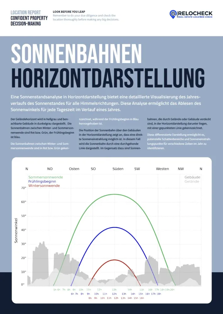
Understanding Sun Paths in Horizon View: Direct Sun versus Blocked Sun
The horizon view of the sun paths is the why behind the maps. It explains when and from which direction direct sunlight is geometrically possible. The graphic is typically structured like this. The cardinal directions are marked, for example north, east, south, and west. That lets you see whether obstacles lie mainly in the southern sector, which is critical for winter sun, or in the east or west sectors, which are critical for morning or evening sun. The terrain horizon and neighboring buildings are shown as a silhouette, the terrain often in a lighter tone and the buildings darker. This silhouette shows how high the surroundings block the sky. The sun paths themselves are shown as colored curves that represent different times of the year, such as the winter solstice, the start of spring, and the summer solstice. The higher the curve, the higher the sun stands in the sky. The most important interpretation point is simple: where a sun path runs as a continuous line above the silhouette, direct sunlight is generally possible. Where the curve runs below the silhouette or is shown as a dotted line, the sun is blocked by terrain or buildings at those times. This lets you answer very concrete questions such as: do I get any direct sun in winter at all, or only diffuse daylight? Is the terrace mainly a morning-sun terrace, an evening-sun terrace, or does it benefit from southern exposure? Is there a short sun window, for example from 11 am to 1 pm, that significantly upgrades an apartment even though it otherwise seems shaded? In practice, this is extremely useful because it builds a bridge between the map and daily life. The monthly maps may show that December is darker, but the sun-path view shows whether that is simply because the sun is lower overall or because the surroundings, buildings or terrain, additionally cut off the light. This distinction is especially important on sloped sites or in neighborhoods with tall and dense development.
How Different User Groups Can Use the Daylight Analysis Without Talking Past Each Other
Because every target group has different priorities when it comes to daylight, it is worth linking the visualizations in the report consistently to actual use questions. For families, the decisive issue is usually not the maximum number of sunlight hours, but whether the living kitchen, children's rooms, and outdoor areas are bright during typical family times such as the afternoon, evening, and weekends. Monthly maps help check the winter reality, and the horizon view shows whether there is any direct sun in winter at all or whether the surroundings block it. For renters and apartment seekers, daylight is often a matter of daily stress and well-being, especially with home office. The heatmap helps compare locations objectively without being on site at every time of day. What matters is translating the map into your own routine. Someone who works out in the morning and is home only after 10 am weights morning light differently from someone who sits at the desk early. Buyers benefit because daylight quality is understood more clearly as a location effect, meaning something that cannot be solved quickly by renovation. That is exactly what makes the visualization valuable: it shows whether shading comes structurally from surroundings and terrain. This reduces the risk of buying a property that is permanently dark in winter. For investors, light quality is part of demand and tenant satisfaction. The report supports evaluating a location not only through macro data but also at the micro-location level, asking whether the site is robust year-round or fluctuates strongly by season. Especially relevant is whether the property has a clear light profile, for example reliable south or west sun, or only very short sun windows. For agents and real-estate professionals, the visualizations are an objective communication tool. Instead of debating whether an apartment is bright or dark, you can show how the surroundings work, why winter light is limited, and which times of day benefit. That makes advice more understandable and helps set appropriate expectations. The common denominator across all target groups is that the maps are strongest as comparison instruments. They do not help you subjectively judge one property in isolation, but help you differentiate several options using the same data structure: where is light stable all year, where is it strongly seasonal, and where is shading a structural risk?
- ✓ Check the monthly maps for November through February specifically: is there winter sun, or do long shadows dominate?
- ✓ Where are the stable bright zones, and where are there clear shadow edges caused by buildings or terrain?
- ✓ Do the sun curves run above the horizon, meaning direct sun is possible, or below it, meaning the sun is blocked?
- ✓ Translate the findings into use: balcony, garden, home office, children's room. At which times of day do you need light?
- ✓ Notice summer peaks too: high solar exposure can mean overheating risk, so think about floor plan and shading together.


